Saturday, October 28, 2017

Planning patterns


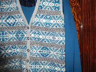
I've really enjoyed wearing these waistcoats during the warm October days we've been having.  I also enjoy seeing the two of them hanging together like this.  It's the colours rather than the patterns, I think.

As I try to explain to non-knitters how I planned the patterns, I can see their eyes glaze as the thought, "You must be mad" passes through. "Planning" is a rather grand term for how I actually did it.

My previous waistcoats have involved two colours only.  Here, I was going for the more traditional Fair Isle shading so I chose two background colours and two pattern colours for each one.  I was knitting a plain back, so that was one of the background colours sorted.  Trying out a little swatch helped me to check that there was sufficient contrast.

Choosing the highlight colour for the middle row was again a question of trial and error.  I went for less contrast on the brown version than on the blue.

Then, I needed my trusty Sheila McGregor book of "Traditional Fair Isle Patterns".  I had a basic formula in mind, so I looked only at the 17 row patterns for individual lozenges.  On the blue  I needed more patterns, so I used some 15 row patterns and placed them within the lozenge shape.  I invented some, especially where only part of the lozenge was in view.

To start off with, I printed off some knitters' graph paper and copied the patterns for the band on to it in pencil, so I had a complete chart to follow.  As I got more used to the rhythm I did not bother doing that and just worked the lozenges from the book.

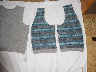
Of course, making it up as you go along - always my preferred method - does have its drawbacks.  Lozenge patterns can be more open, like a grid, or more dense with pattern colour.  Ideally these would be placed carefully on the piece to ensure balance.  You can see the lack of pattern colour on a lozenge half way up one side quite easily on the reverse of this front which is blocking. 


I thought I might top this up with some duplicate stitch, but it is hidden from view at the side, so I did not bother.


Mid-front, though, you can see the imbalance of density in some lozenges.  If I were repeating the exercise I would try to correct this.  

As I said, most people, certainly most non-knitters, do not subject their clothing to this kind of scrutiny.

So, what's next?  In a charity shop last week, my eye was caught by this jumper, in two colours of green, both heathered with those lovely tweedy fibres.  I'm thinking of recovering the yarn and using the dark green as the starting point for my next project... 


Saturday, October 14, 2017

Fair Isle design elements.

Remember this little chair, which we recently renovated?


We were startled and delighted to spot a set of these chairs being used as dining chairs in the film "Goodbye Christopher Robin".  If you get the chance to see it, it's quite a moving story, with some wonderful scenes - but nothing beat seeing those chairs.

So, here's a thing  - spot the difference.

This is my favourite motif from the waistcoat project.  Here it is in brown:


And here in blue:


I was just thinking over how it could be used for a complete design, offset on alternate rows, when I noticed something for the first time.  Shall I give you a clue?

You are looking at the accent colour, that's the green or the wine single central row.

I realised that on the brown design I used it replace the background colour, whereas on the blue version it replaces the pattern colour.  Why does this matter?  Well, because on the blue the spots of wine colour highlight the points of the grid, whereas on the brown this does not happen.  This would be even more obvious over a whole front.

You will have noticed also that on the brown design I used bright colours for the peerie patterns and used a different one each time.  On the blue I decided to stick to neutrals for those intervening bands, and to use the same chain design each time.  This gives an element of continuity to the pattern, which is already very busy.

Some of these are conscious decisions and others just happen, dependent on the yarn available.


Monday, October 09, 2017

Blue Museum Waistcoat

Well, it's taken a while, but this project is now officially done and dusted.  One of the ladies at my knitting group is given to making assumptions about my knitting - that I buy expensive yarn, that I am a quick knitter, that I am a perfectionist...  None of these is in fact true, but of course all things are relative.


This item probably cost less than ten pounds to knit.  I did order three balls of J&S 2ply jumper weight in a range of turquoises, but set one aside as greenish, a second as too light and used only half of the other ball.  The grey, as I said last time, cost three pounds and the other colours were oddments I already had.  Curiously, I opened a button tin I bought at a jumble sale some time ago and the first buttons which came to hand were the six I used here.


The darkest of the turquoises was an oddment.  The risk here was that it would not be quite enough to complete the project.  I reclaimed the length used in the swatch: still not enough.  Rummaging through my stock of oddments, I came across the single remaining ball of a deep turquoise, just the right shade, but a DK.  So then I resorted to unravelling the plies of the yarn to recover sufficient just to complete my project.  I don't think anyone would be able to tell.


I tried it out at work today: even with prompting no one was able to spot that all the lozenge patterns are different on this one.  This took some doing.  I used Sheila McGregor's "Traditional Fair Isle Patterns as my source, using the 17 row lozenges and then topping up with some 15 row patterns.  A couple I made up myself.  On one section I realised that I had transposed the pattern rows for two of the lozenges in the middle of the band.  But it did not seem to matter: this must have been how new patterns were invented.

I can now see clearly which patterns make the best use of the colour changes.  These would bear repeating over a whole jumper.  Maybe that will be my next move.

A couple of images from Marks Hall, the arboretum just to the north of our village.


Friday, October 06, 2017

Pumpkins

Last spring, we took on a new allotment.  After putting in our potatoes, we still had half the plot available, so we planted courgettes, butternut squashes and pumpkins.  The potato crop was heavy this year, but the pumpkins outdid themselves.  On Sunday we delivered our five largest to Paycocke's, the National Trust house where we volunteer, to make a seasonal welcome.

Each one is as much as my husband can manage to lift.


As I put the finishing touches to the Blue Museum waistcoat, I am struck by the different qualities of apparently similar wool.  The base yarn for this is the pale grey, which I used for the back.


Some time ago, I spotted a bargain on e-bay.  I think I paid three pounds for this pack from the 60s, probably, given the styling.  That's enough tweed fabric to make a skirt, and twelve ounces of yarn for the jumper. Made by Pringle of Inverness.


The yarn is quite loosely spun  and sheds a bit.  But knitted up on 3mm needles it makes a beautiful fabric with lots of subtle marling.  And it marries in very well with J&S 2ply jumper weight.


I probably won't be making up a matching skirt.